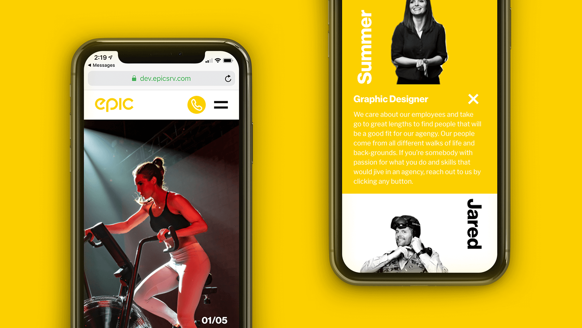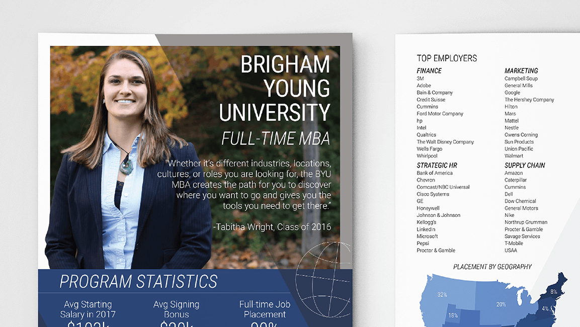
All of the pages that I designed for this team were with the purpose of driving more sales and installs for Vivint Smart Home.
I was told going into this job that I would be working for the team that probably cared the least about the way things looked versus how they performed. I made it my goal to bring the creative back into brand standards while still performing high from day one.
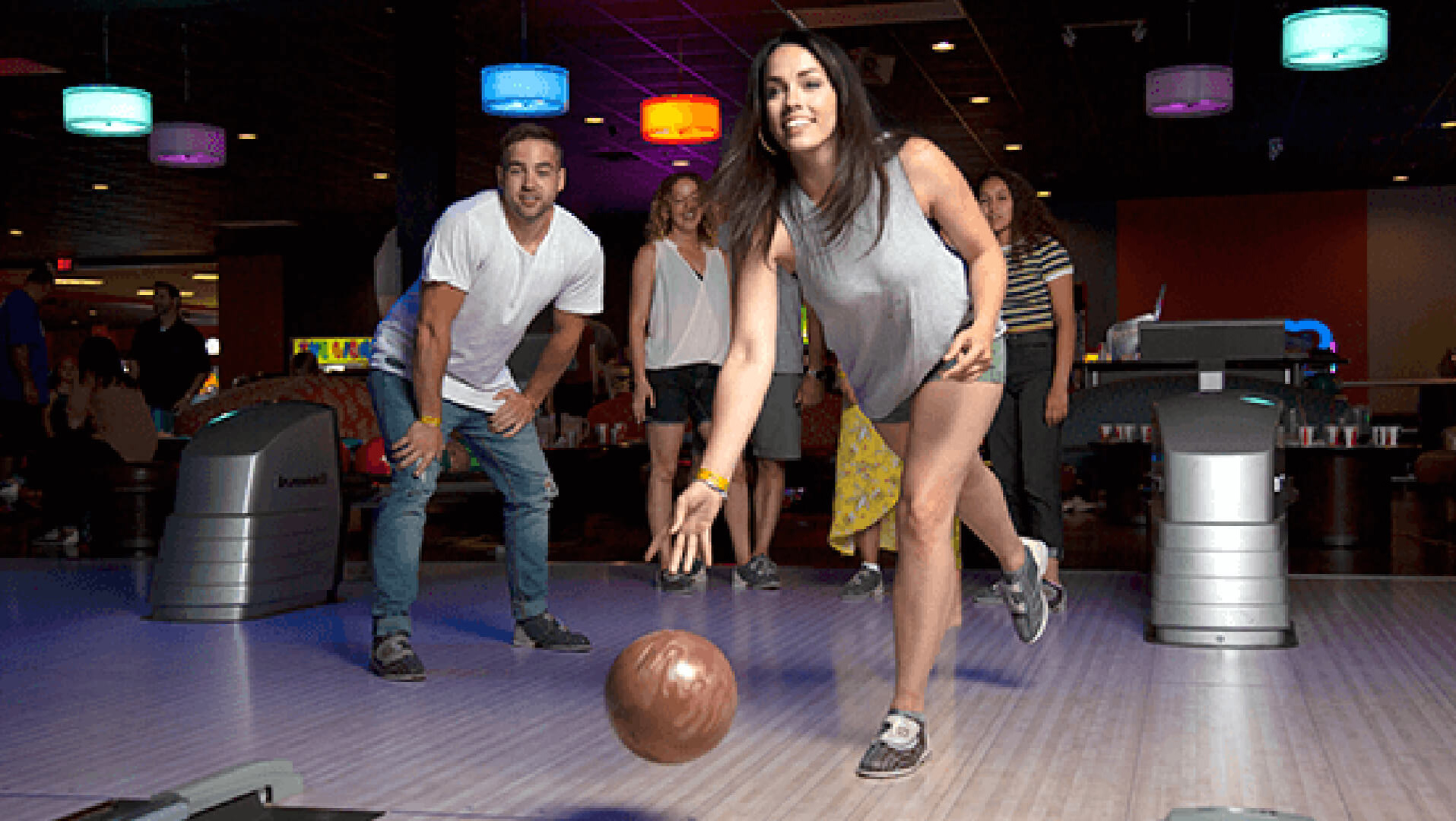
Vivint Love Campaign
I worked directly with a group of influencers through Home Love Network on this project. I designed this page for them to have somewhere to send email traffic and sell Vivint's products and services to their customers.
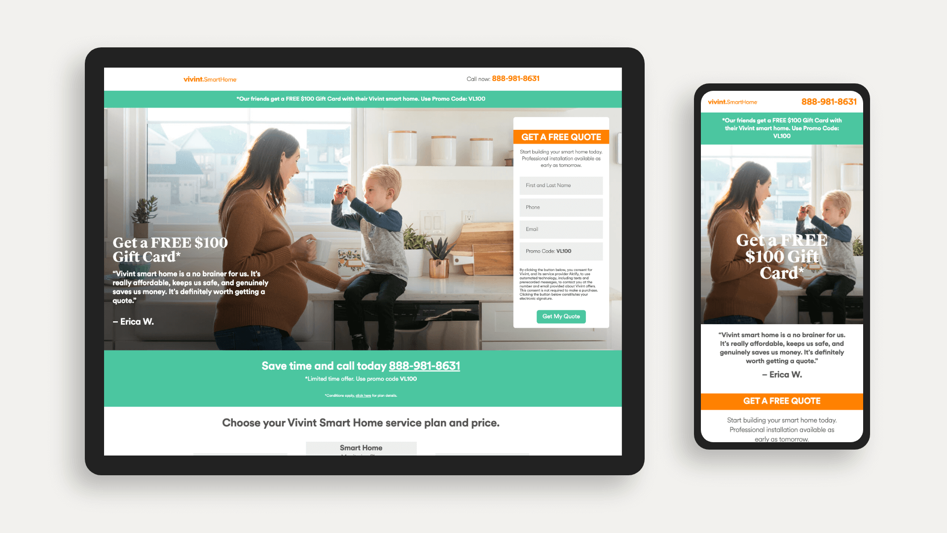
Design notes: it seemed particularly appropriate to include a lot of photos taken of beautiful homes and families given the context of Home Love Network—a show on HGTV.
Everything designed for Vivint Love was given a softer and more emotional spin on the brand. I used pictures of families and chose to use Vivint's less common green with accents of orange.
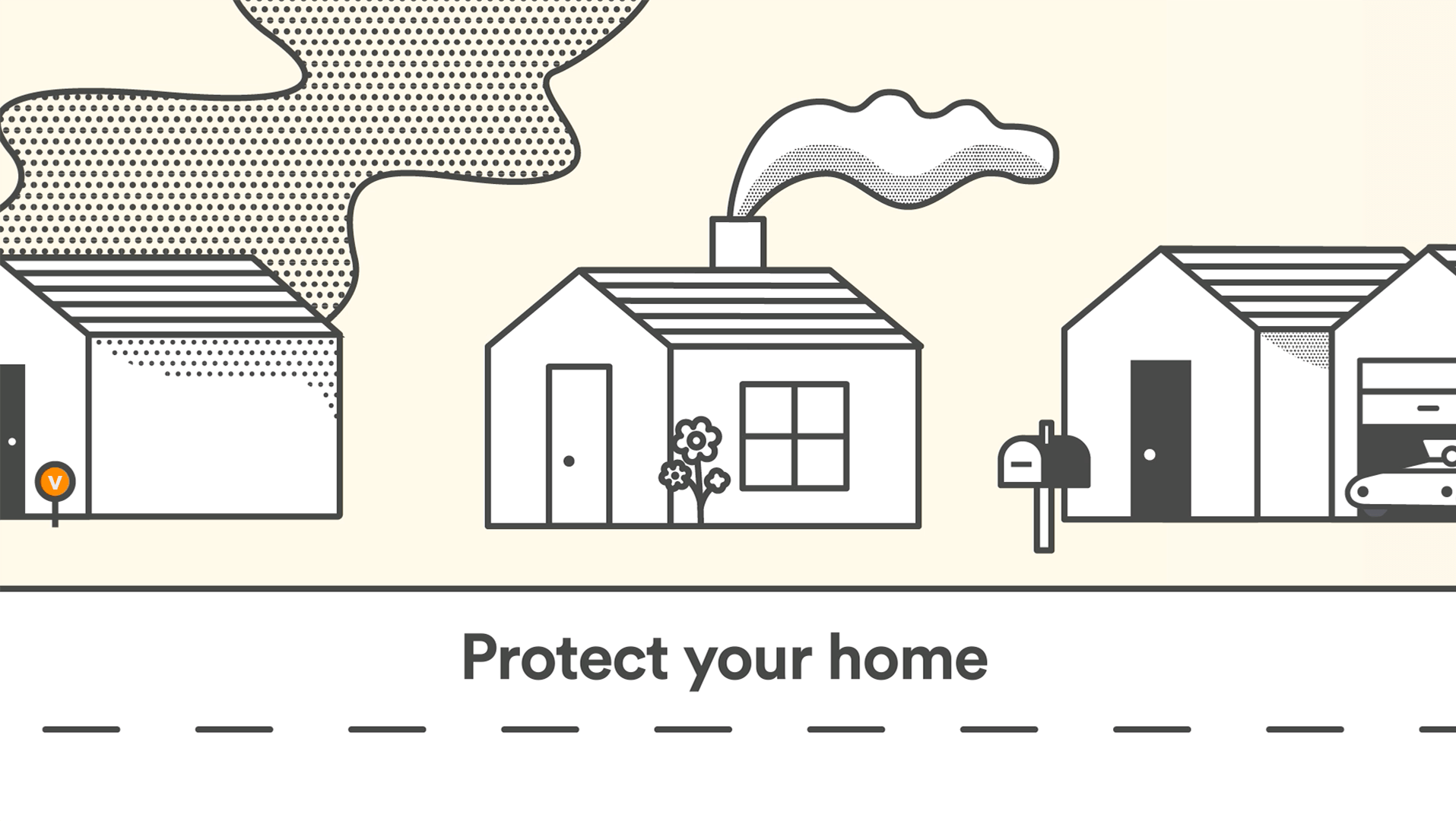
Smart 15 Campaign
The /smart15 landing page is what I call this project. It was designed with the intent of driving clients from our partner sites to call or fill out a form and sign up for a Vivint Smart Home.
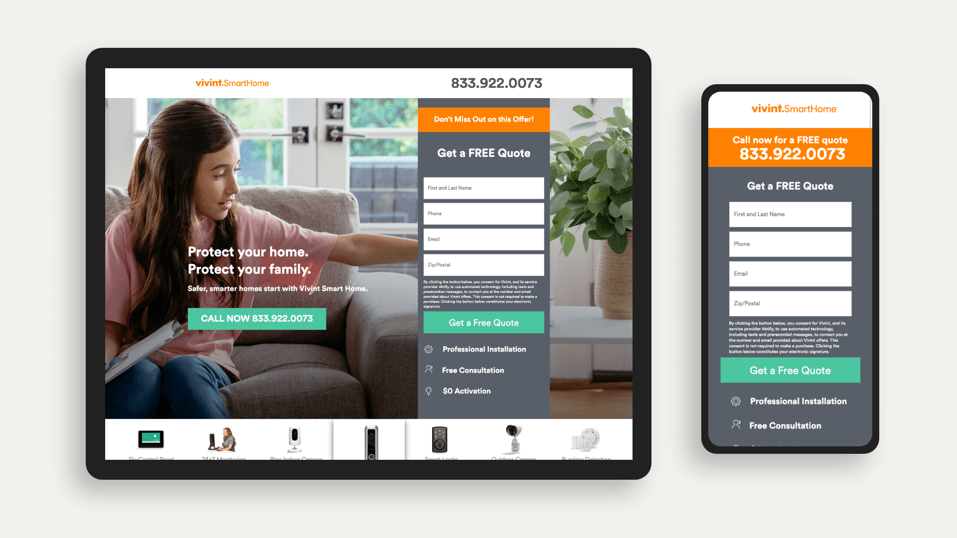
Design notes: At the time this page was designed, I felt pretty clever having her arm go into the form. All of the visuals were designed on this page to lead the eye to the form and phone numbers.
There is also a form at the bottom of the page before the customer reviews that gives the user one last chance to get a FREE (see what I did there) quote!
The mobile version of this page doesn't include the hero image because the team insisted that it wasn't necessary and would lower conversion. Based on the page's performance, we determined that was accurate.
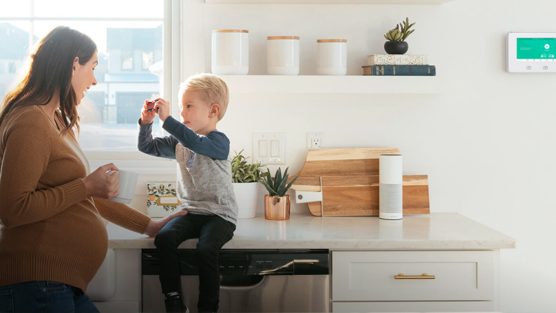
Smart 14 Campaign
Around 90% of the traffic on this page is sent to the mobile version. It has been used to drive installations since I designed it during summer 2018, and has been one of the highest performing pages the affiliate team has seen.
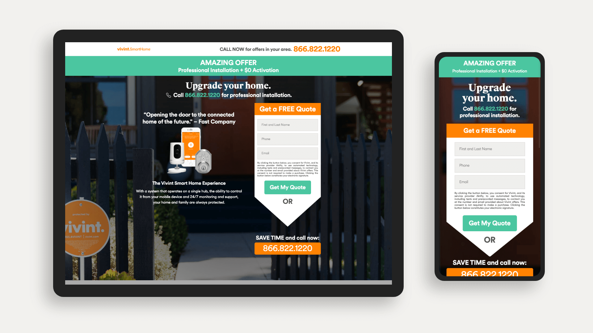
Design notes: Let's address the elephant in the room... Yes, the form is shaped like an arrow. I used this design strategy to help users down the page to get them to call in.
The dark background on this page contrasted very intensely with the form to get the attention of people.
This page was a solution provided as a redesign to a page that looked like something out of a newspaper advertisement for used cars. It was toned down significantly, didn't stray too far from brand standards, and performed extremely well in driving installations.
Notes from coworkers:
"Eric's design talent is undeniable. I was impressed with his ability to consistently deliver quality creative assets in a timely fashion. Eric has passion for his work, and his results speak for themselves. I enjoyed working with him, and I would highly recommend him to any organization."
– Zac Bitsoi, Senior Affiliate Program Manager, Vivint Smart Home
"Eric and I worked on the affiliate team together Vivint. Eric’s keen eye for design resulted in increased leads, sales and installs. He understands all aspects of design and how they play a role in the marketplace. Not only were Eric’s designs always top notch, but he always completed them in a timely manner. I never needed to worry about a job being left undone, because Eric always put in the time and always delivered quality results."
"Aside from his talent as a designer, Eric is simply a delight to be around. He has a great way of bringing everyone together, and making everyone feel included. He cares about those he works with, and strives to create an atmosphere of openness and acceptance. I would highly recommend him as an asset to any organization."
–Kathryn Hyer, Affiliate Marketing Brand Associate, Vivint Smart Home