My Role:
I created the visual identity as well as site architecture, based on the existing site and analysis of the most visited pages as well as best practices in the advertising and marketing industry.
Disciplines:
Project Timeline: 2 months
Project Workers: Eric Moore (Designer), Ana Aviles (Designer), Kierra Palmer (Developer)
The live site is currently in development.
Problem Statement:
Epic Marketing has been stuck with mostly production work and wants to start winning better accounts. They complain that the site feels dated and is outperformed by other agencies in the area in many ways.
Question: How might we design a website that will help Epic more frequently win bigger and more creative-driven clients?
Project Goals
Design a website and brand identity that comes across as premium. Appeal to the higher-end of the market.
Drive with creative—higher quality creative, even in production design projects.
Establish long-term relationships. Encourage relationships with big asks and big wins!
Remain adaptable to what comes their way. Don't hurt the love group or scare away clients they might want to work with.
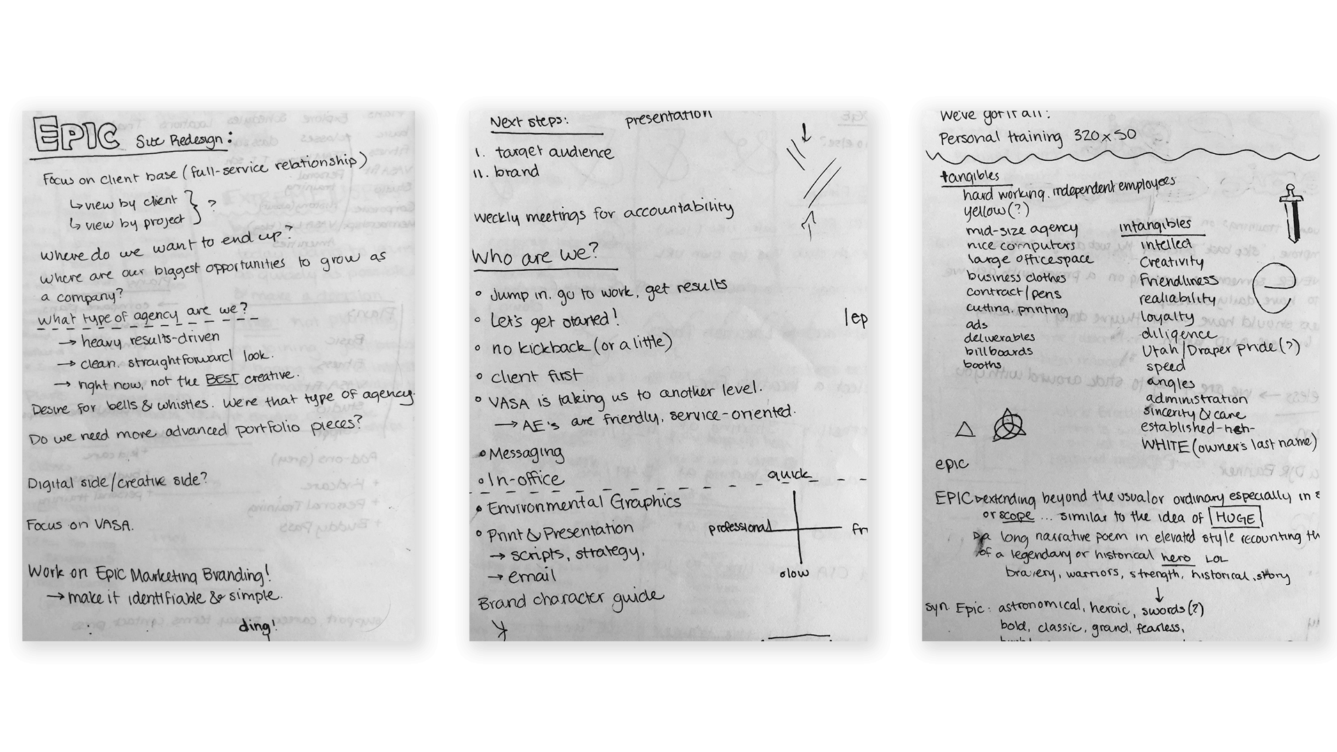
Select Notes & Research Results:
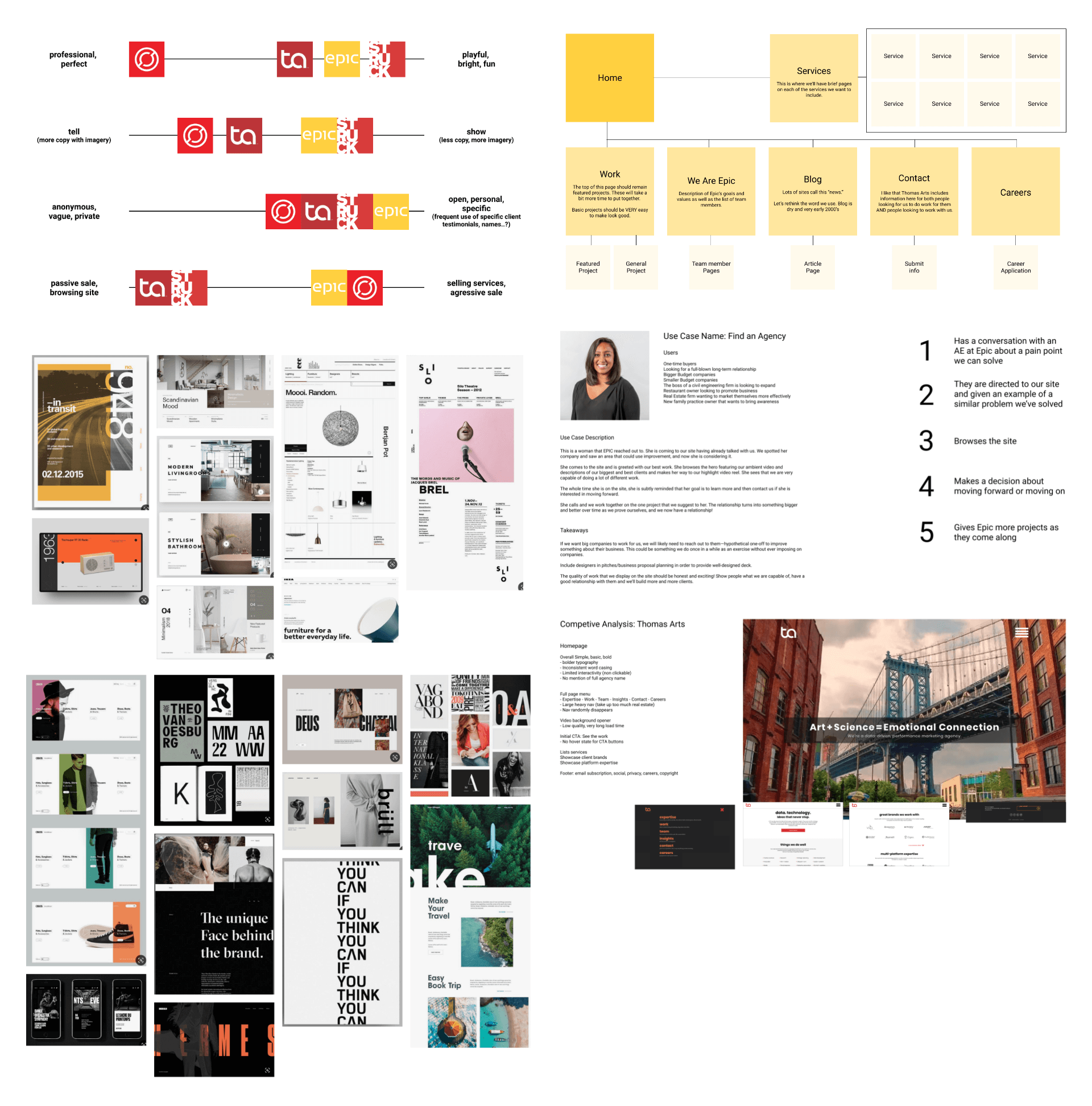
Research Methods
Competitive Analysis
Information Architecture
Client and Coworker Interviews
User Personas/Use Cases
Journey Mapping
I used the first few days of this project to gather as much information as I could from the owner, creative director, and others within the company who are familiar with the brand. We set goals, determined who our target audience was, ran through common use cases with individual personas, and worked through a formal competitive analysis together.
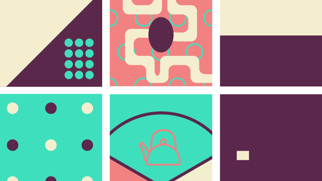
Research result samples (left to right):
Brand definition, site architecture, mood boards, use case example, and competitive analysis example
Research-Driven Design Decisions:
We certainly had our work cut out for us when we got into this phase of the project. The other designer and I worked for about a week and a half and had several meetings before landing on a look and feel that would not only appeal to the target audience, but also be approved by the client.
We chose to use large lettering and high contrast to give the site a modern and premium feel, as well as stick to a lot of negative space, blacks and whites.
Our site architecture was designed around use cases established for higher-level executive personas.
We landed on attention to the details of our favorite websites, including motion where appropriate, text fading in and out, and enjoyable interactions with commonly used tools such as the nav and search bar.
We avoided appearing to copy any other agency by sticking a lot to the way the Epic brand was naturally evolving. We didn't want to become something the brand is not ready to be.
Site Style Guide (premium, but also friendly):
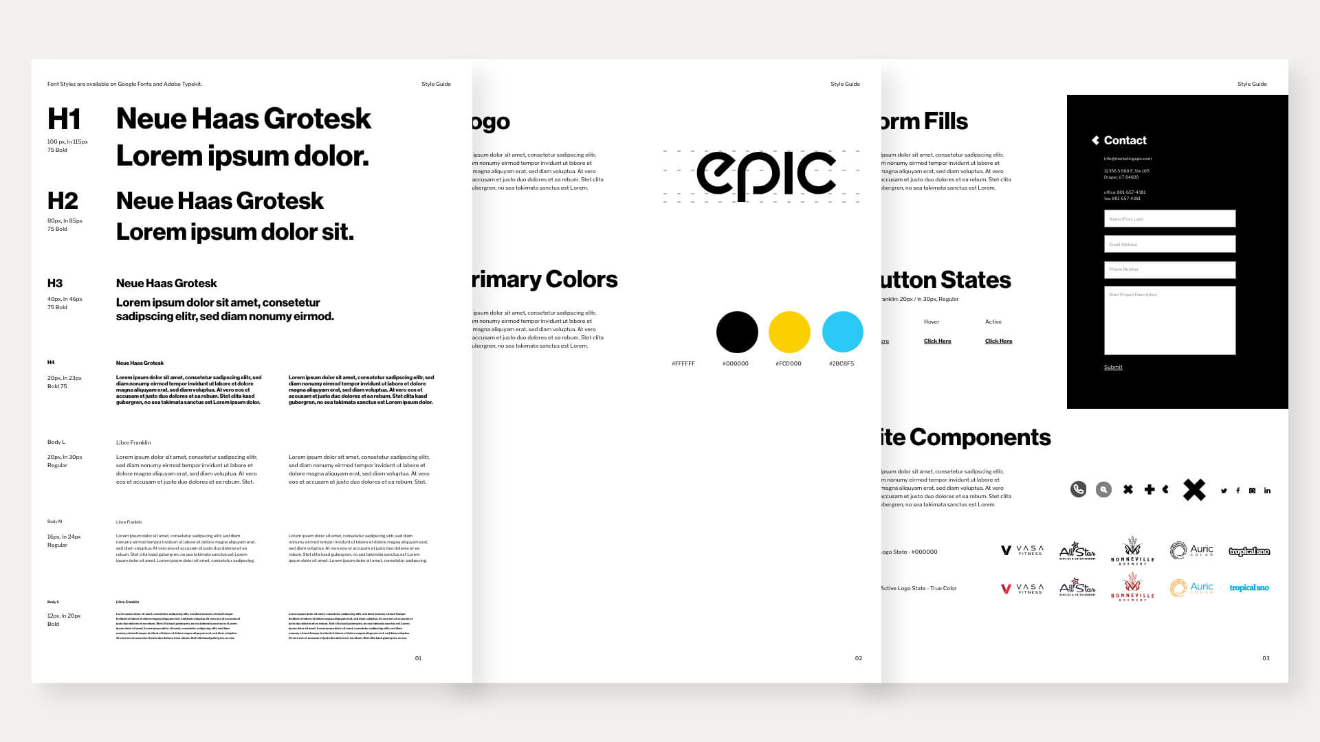
I tried not to depart too far from Epic's old brand by sticking to the general colors. The logo was tidied up, and I dropped some of the dated typefaces and brought in some very recognizable header fonts. Neue Haas Grotesque is a typeface very close to Helvetica—probably the most recognizable font—but modernized and cleaned up.
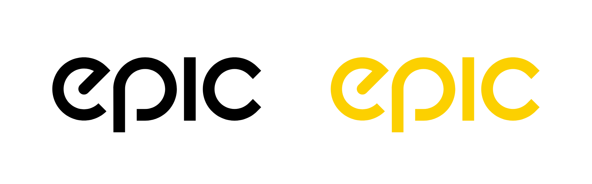
Logo Design:
Select Wireframe Iterations:
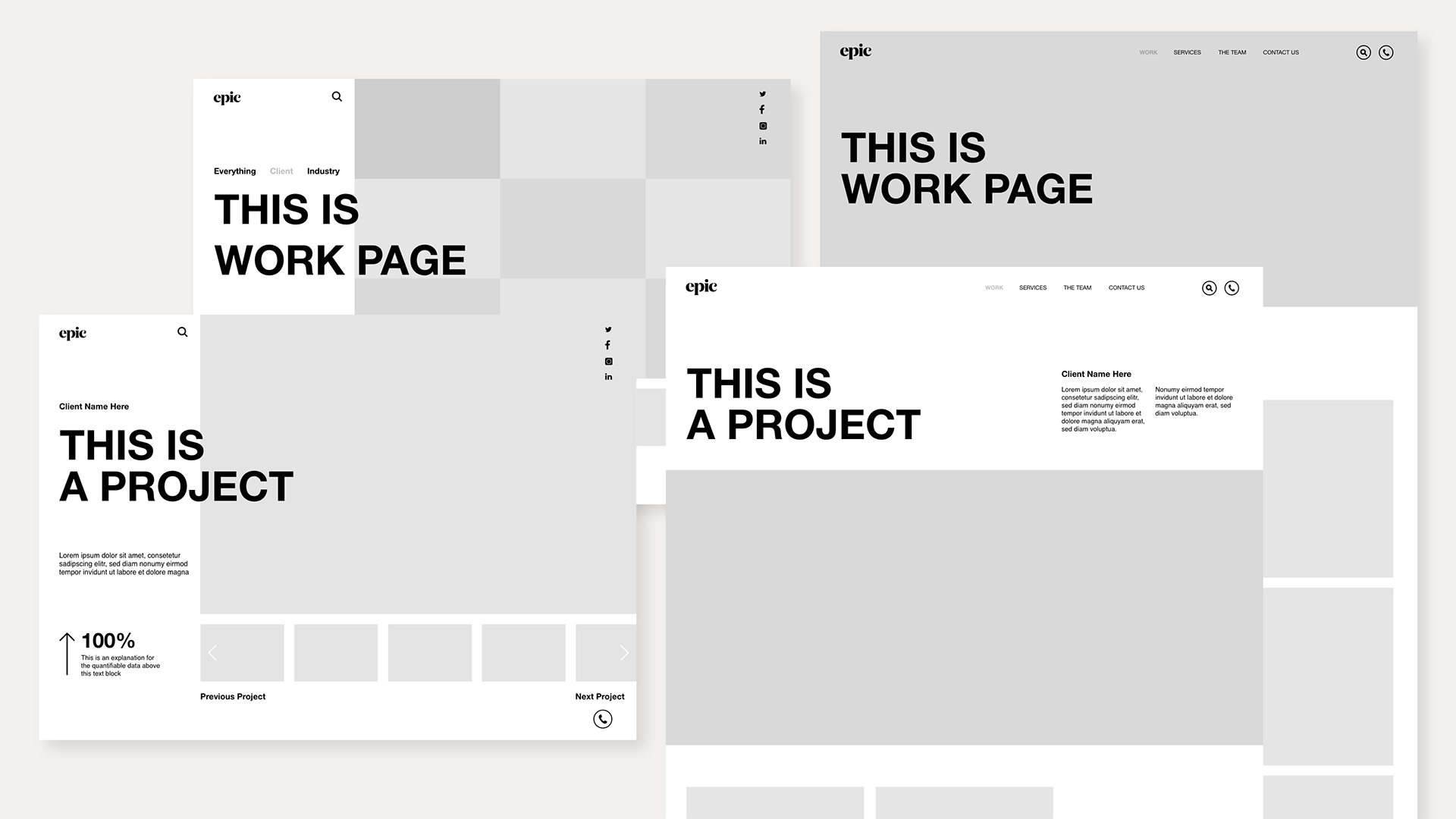
Following user research, the creation of the style guide and several iterations of what the client wanted, I was ready to move into the high-fidelity version of the design.
Using insights and following the guidelines established, I followed through with designing a site that would meet the needs of many users I wouldn't have considered on my own. Once the site is developed, further testing and iteration will occur with the help of in-house designers and developers.
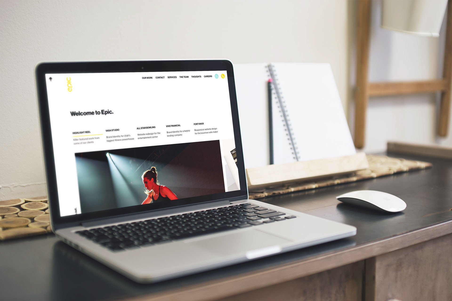
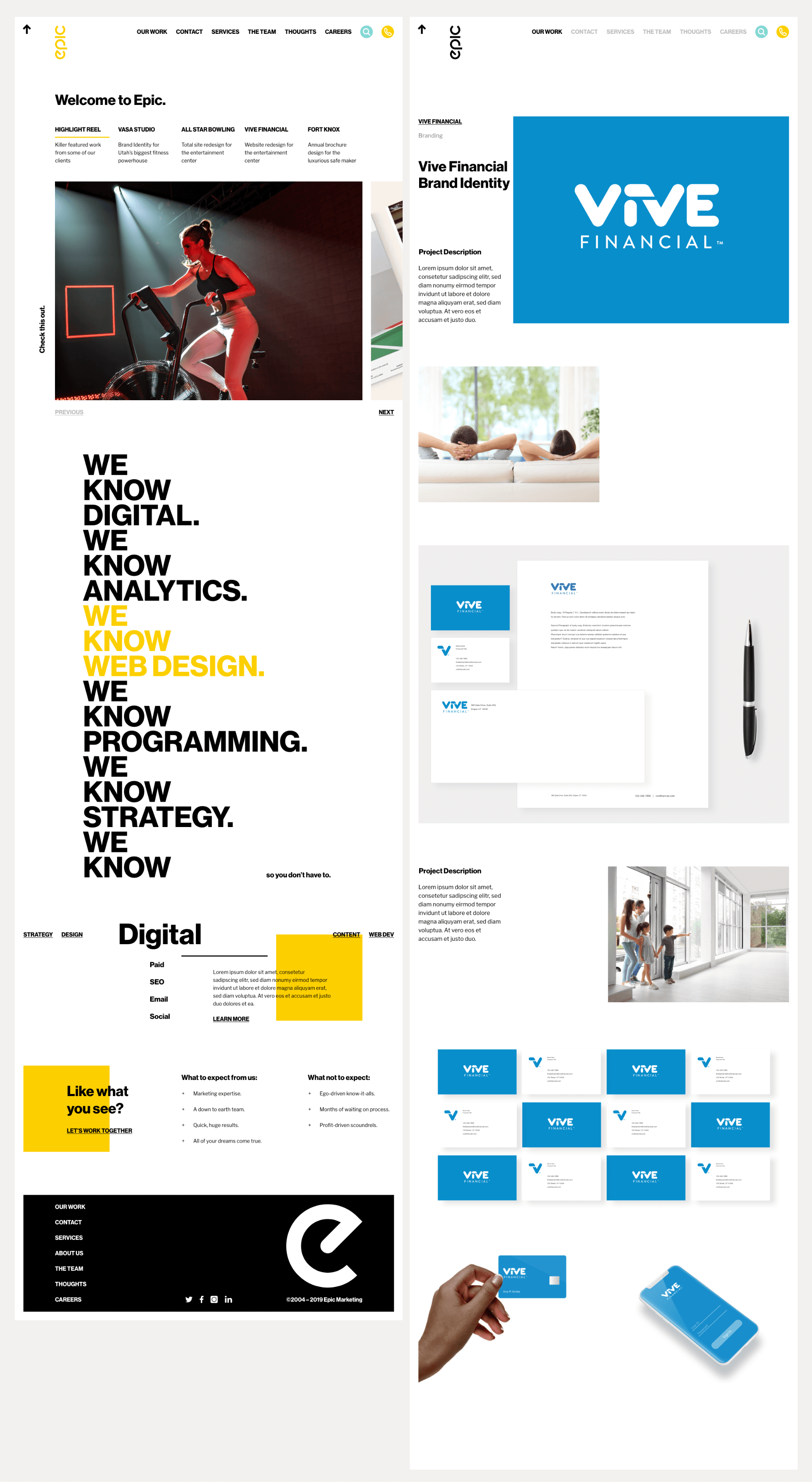
Final Screens:
Homepage, Project Sample:
"I take it the clients this agency is landing are probably mostly multiple-million dollar accounts."
– Anonymous Marketing Agency Owner
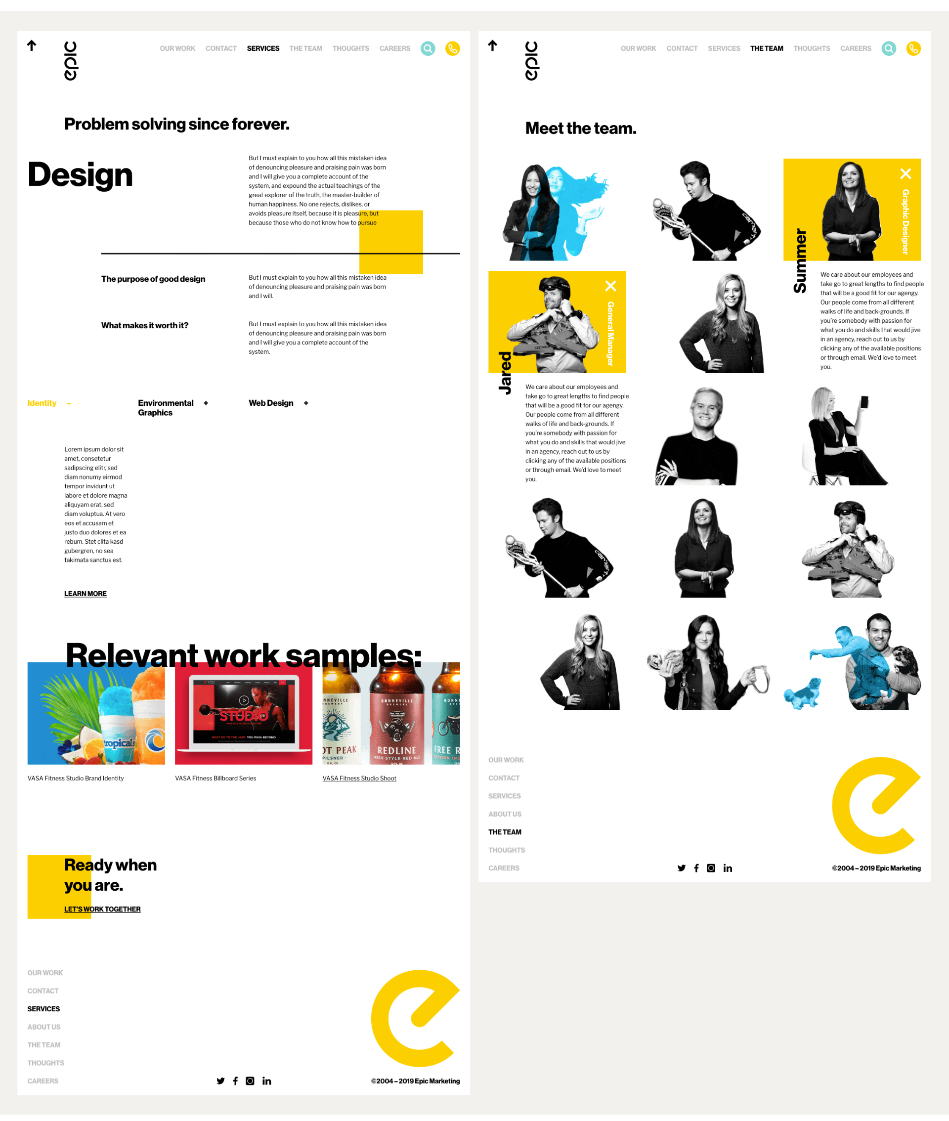
Design (Services), The Team:
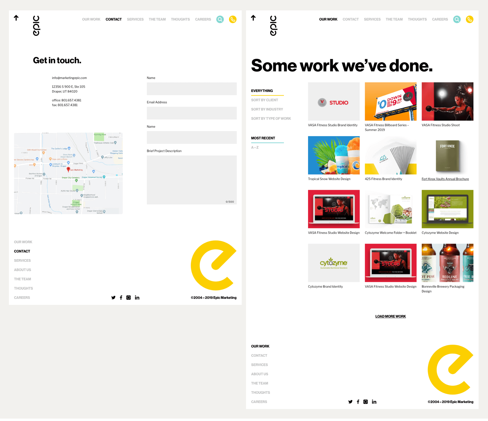
Contact, Portfolio View:
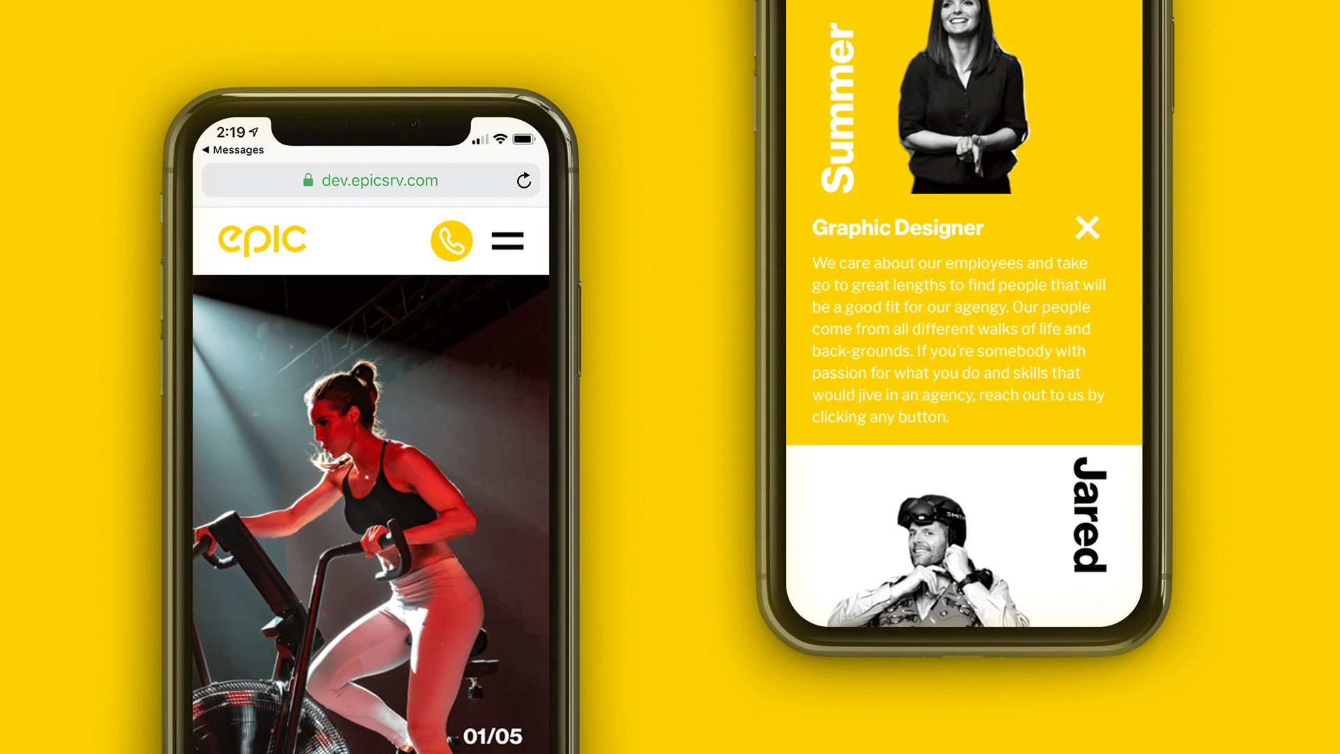
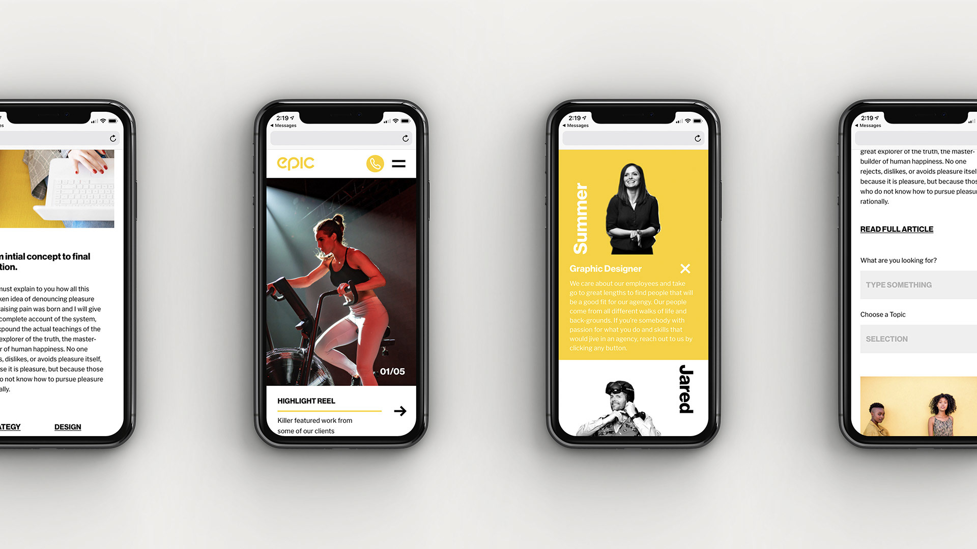
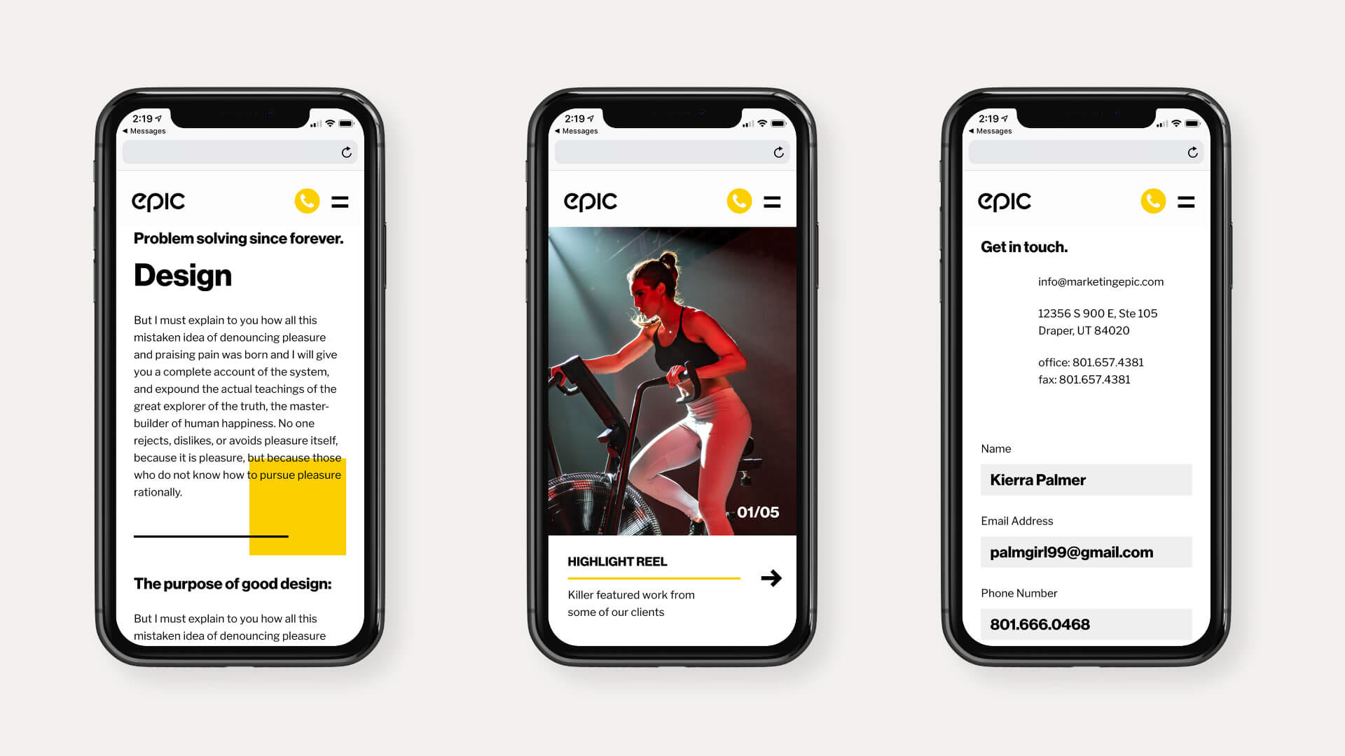
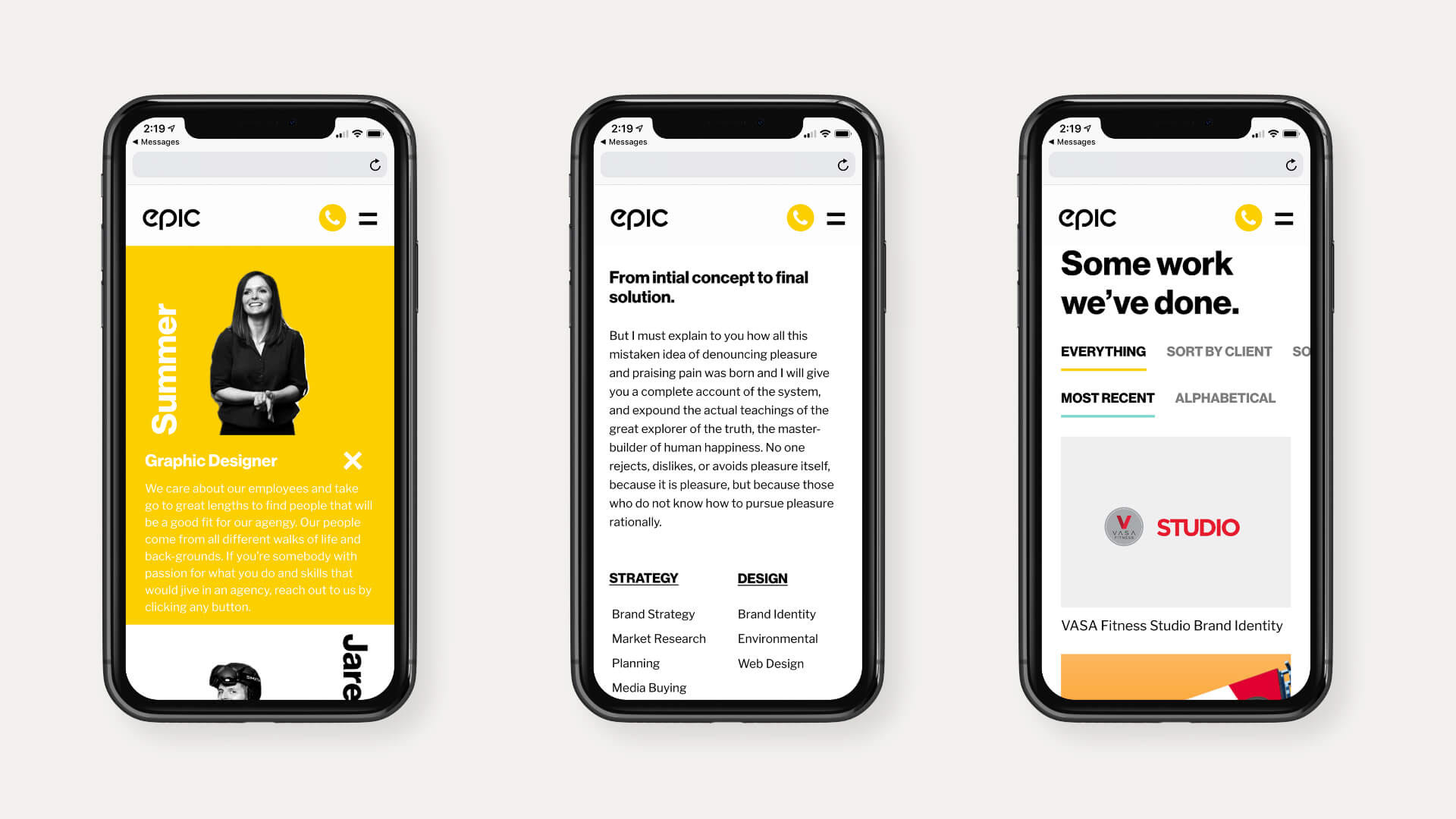
Mobile Screens:
"I love the personal touches this site focuses on. When I type anywhere on the site, I feel like I'm part of something special."
–Anonymous User
My Own Findings & Experience
Other than at the very beginning of the project, I worked this whole design out on my own. I found that the best part about it for me was realizing how much I am capable of doing when I still involve users and other designers along the way in iterating and reviewing my work.
This was definitely the biggest project I've taken on as lead designer. A bit of guidance would have helped, but I feel like I'm leaps and bounds from where I was at the beginning of this project.
I had a hard time finding a large number of users to talk to, so I reverted to seeing what other successful agencies were doing. While I'm happy with the result of this project, I know that I could have tried harder to talk to more people.
Content is key. In the future I really want to plan out the words and images that I'm going to use all at once. Otherwise, it gets handed off to development and might mess with the design later on.