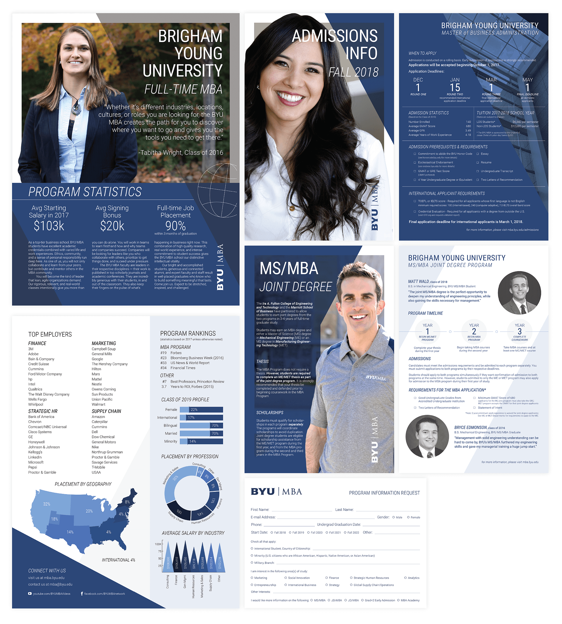
A Highly Esteemed Program
The BYU MBA is the #19 ranked MBA Program in the country, according to Forbes, and they want to make the right impression on their potential candidates. The handouts they gave me to work with were mostly scrapped. What was kept was some of the body copy, but even that was reduced. My client and I agreed that going with a "less is more" approach would be much more attractive than what they currently had.
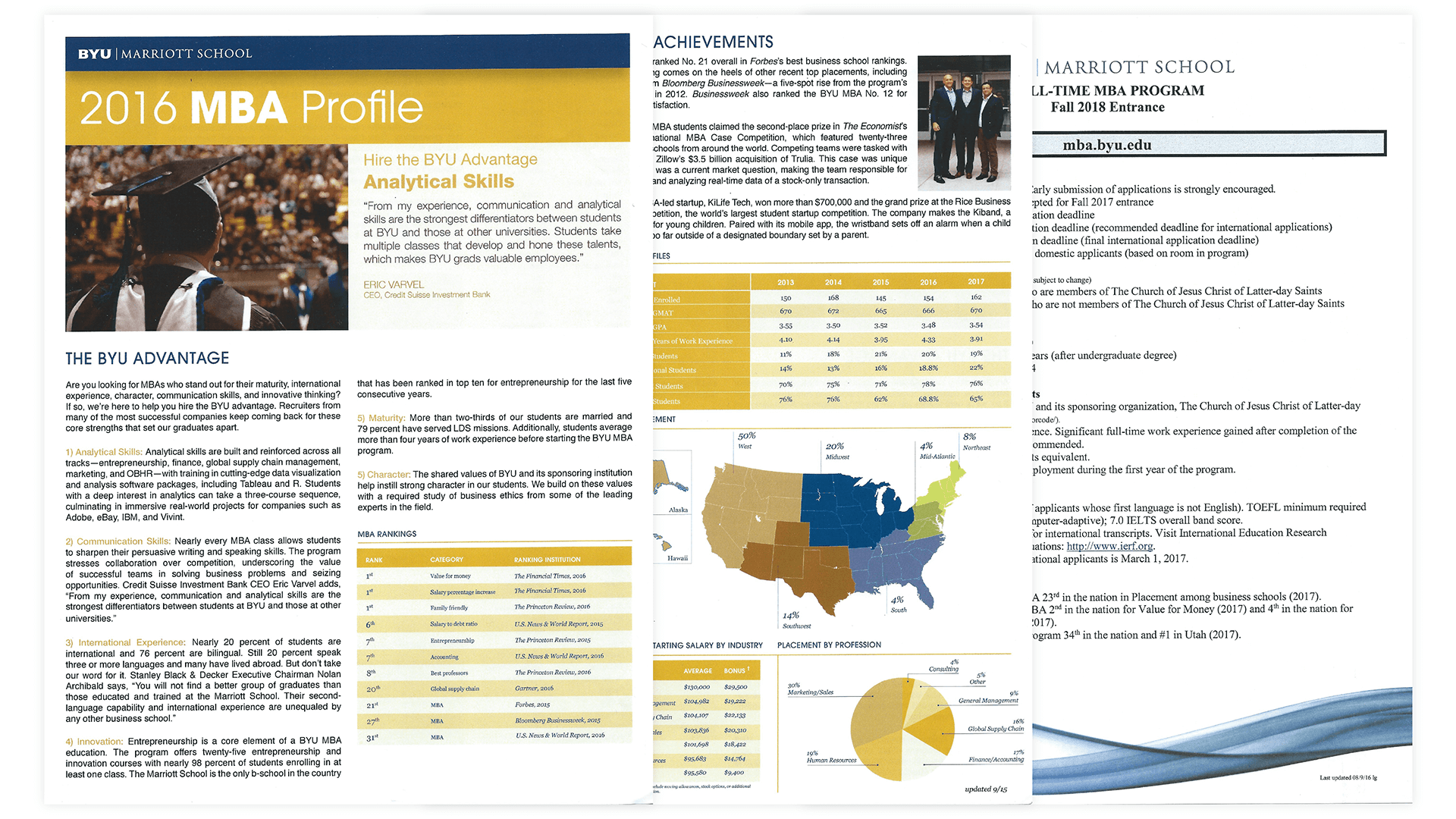
The Original Design
This is what I was given to work with. My client was obviously not very attached to it. She told me I could scrap it all and start completely over if I wanted. The old information sheets were very informative, but also didn't have much else going for them. There was one page that was done by a designer, but even it wasn't a fair representation of the quality of education the BYU MBA provides.
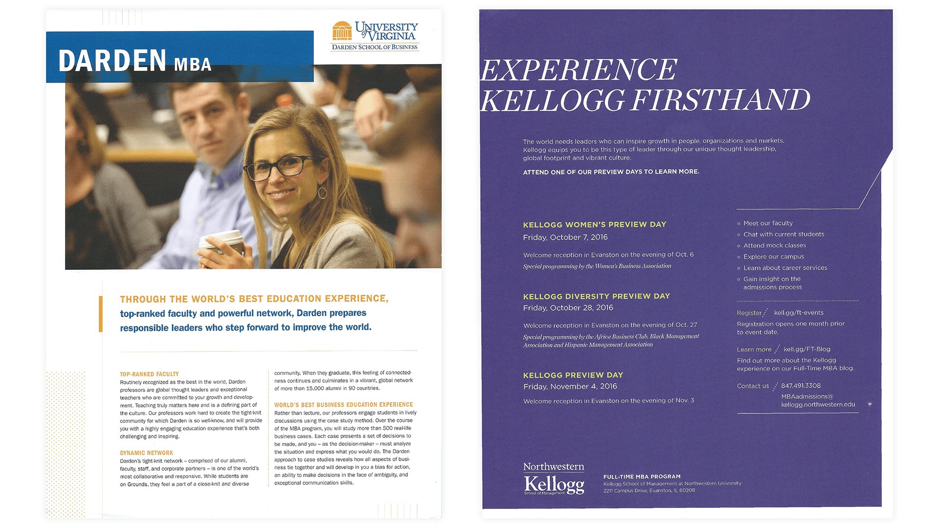
Analyzing the Competitors
I was provided with a lot of different handouts from other top-ranking schools to give me a better idea of what the BYU MBA was looking for in their recruiting handouts.
The biggest thing that the designs the other schools were using were their use of their own school colors and their simplicity in word choice. It seems like the universities that are the most impressive feel the least need to brag about their accomplishments.
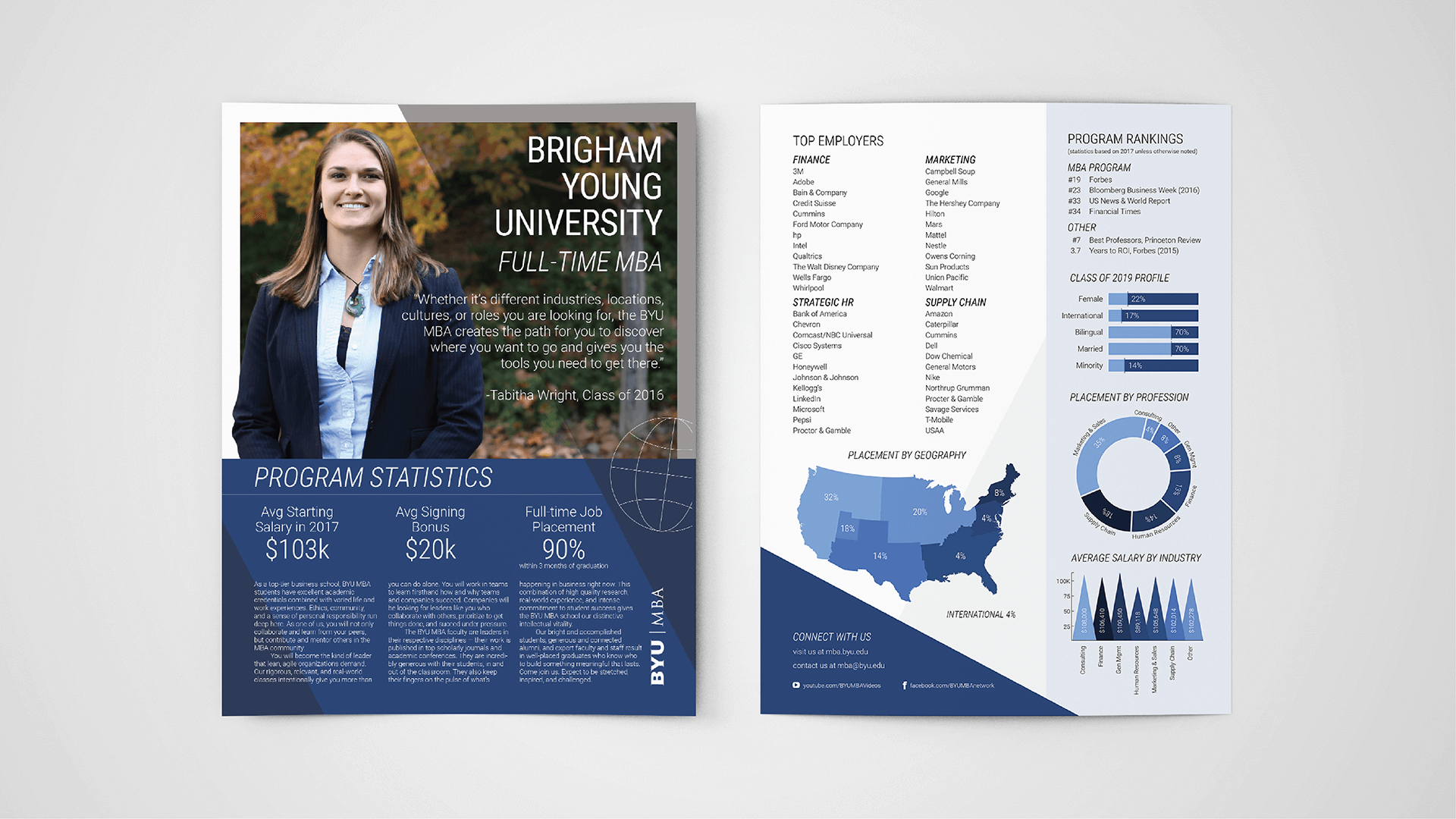
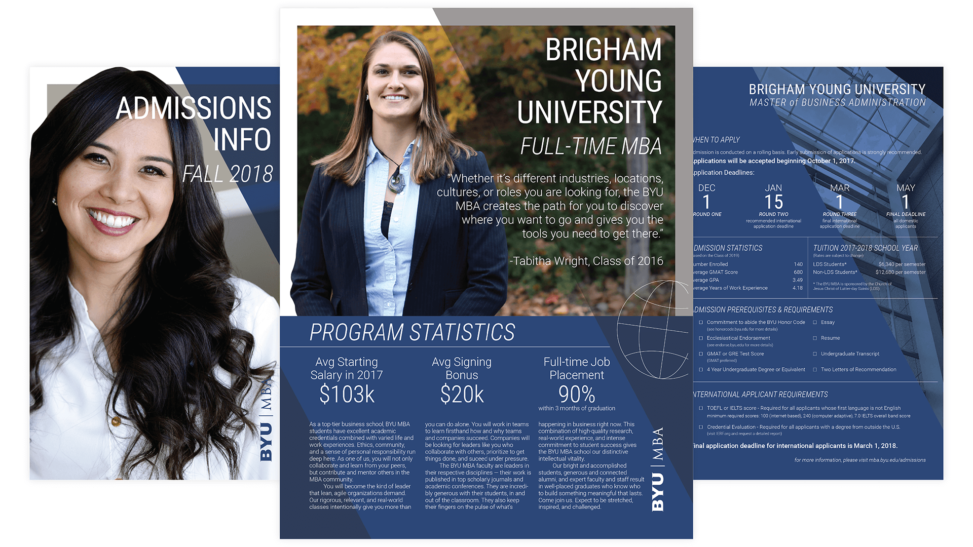
The Redesign
The single-sheet design was chosen at the request of the BYU MBA. Candidates will be given as many of each sheet as they want, but it seemed inefficient to have one book with all of the information in it when not everyone wants to know everything. We chose to showcase real students from each of the programs to give the collateral a more welcoming and relatable feel.
The angles are taken from the "Y," which is a very important symbol to BYU. It is one of several elements that ties the documents together. Other elements include color palette, typeface choices and sizes, logo placement, and picture placement.
The Full Design