My Role:
Disciplines: UX Design, UI Design, Web Design
Project Timeline: 3 months
Project Workers: Eric Moore (Designer), Kierra Palmer (Developer)
Problem Statement:
The brand doesn't include a very wide demographic. It's clear the brand was directed at kids when the site was created. The whole old site looks like it was designed in the early 2000's.
How might we design website to appeal to a larger target audience?
How might we design a website that is easy to update without breaking?
Bowling/Party Reservation System Redesign:
The website's reservation system is linked to a third party developer in Sweden, so it was hard to work through this redesign with the time difference and inability to meet in person, but I did it.
The transition from All Star's site to the reservation system became seamless following the redesign, and the UX was greatly improved.
Typeface and Button Style Guide:


A new primary dark, neutral color was added to the palette in order to not feel so childlike. There are pops of bright color that keep the arcade/entertainment center-feeling alive, and they glow on hover.
Logo Redesign (old, new)


The logo was tidied up in order to help give it a more mature and refined look and feel.
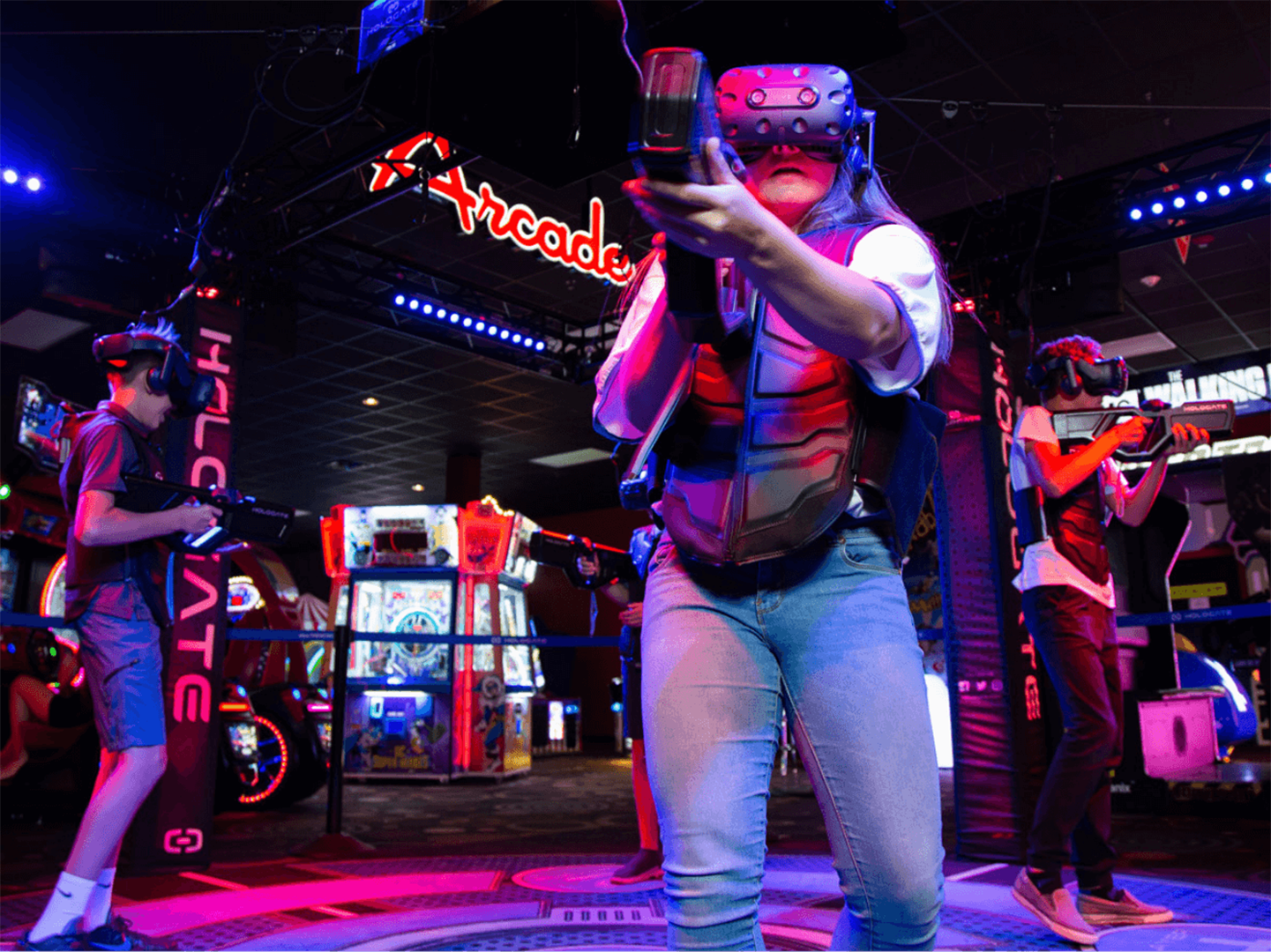
Photography Style Guide:
Final Screens
